Tampilkan postingan dengan label fashion. Tampilkan semua postingan

Rabu, 04 Desember 2013

Dresscode - Responsive Joomla VirtueMart Theme (Retail)

Dresscode is premium joomla / virtuemart theme. Original design, custom modules, qualitive support – the best choice. Dresscode is a multipurpose theme which you can use for many different purposes; Blog, Catalogue, Company Site, Store etc.


Full Features List


  • Responsive theme

  • Unique Exclusive banner/slider

  • Product labels (“new” and “sale”) on product page, in categories and on other product listings (editable from admin panel)

  • Deal of the day

  • Hidable footer

  • Unlimited colors

  • Easy Install

  • Ajax Add to Cart

  • Custom admin module

  • Flexible navigation menu

  • Google Fonts Integrated

  • Fully customizable Slideshow

  • Slideshow comes with touch navigation for mobile

  • Drop-down shopping cart in header

  • Best sellers block

  • Tabbed product data, reviews on product page, video option

  • Integration with Cloud Zoom to enlarge product images

  • Compatibility (IE8+, Firefox, Opera, Safari, Chrome)

  • Optimized, well-structured and commented CSS , HTML and PHP , images

  • .Psd files included

  • Social bookmarks for products

  • Product page comes with custom cms blocks.

  • Change image on hover

  • Home page button in the main navigation menu

  • Latest tweets & Facebook fan box in footer

  • SEO Friendly Design and Layout Structure. Compatible with all VirtueMart SEO features


Included to the price of template. Our almost 24/7 staff will help and answer all your questions.


IMPORTANT
* Images used in preview are not included in theme.
You can purchase them separately from Bigstockimages:


http://www.bigstockphoto.com/image-12123992/stock-photo-attractive-couple
http://www.bigstockphoto.com/image-12126692/stock-photo-fashionable-lady-wearing-sunglasses-with-helicopter-in-the-background
http://www.bigstockphoto.com/image-12127673/stock-photo-handsome-man-with-bag
http://www.bigstockphoto.com/image-12127562/stock-photo-attractive-blond-beauty
http://www.bigstockphoto.com/image-12127631/stock-photo-fashionable-couple-over-alpine-mountains

Selasa, 03 Desember 2013

Zonda - Responsive eCommerce PSD Template (Fashion)

Londa designed for opencart, magento, woocommerce and prestashop platforms.

Features


  • 5 Homepages

  • 25 PSD template

  • Fully responsive design

  • Well organized layers

  • Only free google fonts used


PSD Files included


  • 01_home_01.psd

  • 02_home_02.psd

  • 03_home_03.psd

  • 04_home_04.psd

  • 05_home_05.psd

  • 06_category_grid_01.psd

  • 07_category_grid_02.psd

  • 08_category_grid_full_width_03.psd

  • 09_category_list.psd

  • 10_product_page.psd

  • 11_Blog.psd

  • 12_Blog_Post.psd

  • 13_Portfolio_01.psd

  • 14_Portfolio_02.psd

  • 15_Portfolio_03.psd

  • 16_portfolio_items.psd

  • 17_contact_us.psd

  • 18_my_account.psd

  • 19_product_comparison.psd

  • 20_shopping_cart.psd

  • 21_about_us.psd

  • 22_404.psd

  • 23_shortcodes.psd

  • 24_home_320px_01.psd

  • 25_home_320px_02.psd

  • 26_sticky_header_01.psd

  • 27_sticky_header_02.psd


Images what you can see on screenshots are not available in the package

Lineza - Ultimate Unique Magazine PSD Template (Creative)

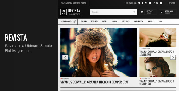
Lineza is a Ultimate Simple, Clean, Unique Magazine PSD Template. Very High Recomended use for Fashion Magazine, Blog, News or anything you think it will be suitable.


Fully editable & Organize PSD.


Fashioniza PSD Templates consist of 15 PSD :


home ver 1
home ver 2
home ver 3
home ver 1 wide
home ver 2 wide
home ver 3 wide
category 1
category 2
category 3
category 4
category 5
Detailed Post
Detailed Rating percentage
Detailed Rating star
Detailed Rating

Font Used is :
Oswald
Droid Sans


Icon Used is :


Font Awesome

Image used for preview only


Great photo by
Mark J Sebastian

Check Out Other Template


Threads responsive email set (Email Templates)

Two tasty html email templates with responsive mobile layout – perfect for fashion and clothing stores. Use the layered design files to customise the design to match your brand.


Also includes special Campaign Monitor versions.


Template features


  • Responsive layout for mobile

  • Contains Campaign Monitor tags – singleline, repeatable regions

  • Two template designs

  • Standards based html – Inline CSS and table based layout

  • Well commented code

  • 630px wide

  • Includes layered PNG & PSD files


Similar item


Appetizer html newsletter

  • Responsive layout for mobile

  • Includes bonus promotional template

  • HTML files included + identical Campaign Monitor versions


Help & feedback


If you run into any problems, let us know and we’ll try to help :)

We also appreciate all feedback, good or bad. If you have any comments or questions please feel free to email us or leave a comment and we’ll get back to you as soon as we can.


Don’t forget to rate this item – it only takes a second and really means a lot :D

Mars - Clean, Fluid and Responsive Zen Cart Theme (Zen Cart)

Follow me on ThemeForest
Follow me on Twitter


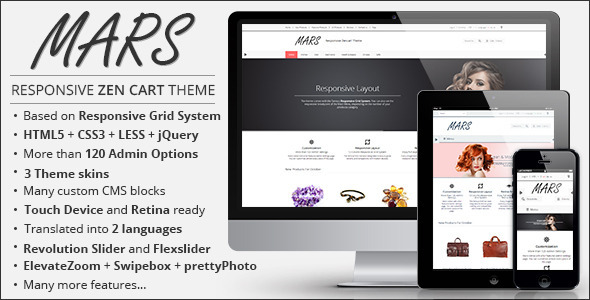
Mars is a clean, modern responsive Zen cart theme, suited for any e-commerce website. It was built with the latest technologies like HTML5, CSS3, LESS and the famous Responsive Grid System.
Thanks to this it is optimized not just for desktop but also for mobile and tablet devices.

It is extremely customizable thanks to the more than 120 admin options which ship with the theme. You can check out some of the main features below !!!

3 beautiful skins were also included in the package and you can also creat your own custom skins. Just check out the great documentation for further information.


Every piece of the theme was carefully made and tested, but in case you find some bugs or you have any questions which you can’t find in the documentation don’t hesitate to contact me on my profile page.
I will be more than happy to help you.


Intro

Table of Content

Responsive Layout

Mars is based on the famous Responsive Grid System. This way your site always adapts to any kind of device
making it a perfect choice for any kind online store which has to be viewed not only on desktop but also on
mobile and tablet devices.


Customizable

Above you can see a fraction of the themes customizable options, but because is powered by a powerful
admin panel you won’t have any problem adjusting it to your needs. Everything depends only on
your imagination because the foundation for a great looking site is already laid. :)


3 Custom Skins

The theme comes with 3 beautiful skins which can be used as they are or be the base for a customization,
which can be done either through CSS or LESS.


Great Documentation

With the themes extensive documentation you will be able to easily find everything what you are looking for.
Just type in the search box the desired text and when you find it click on it and the page will scroll to that
section.


2 Site Layout

You can choose between two types of layout: Fullwidth or Boxed. Set it as however you like it.


Adaptive Shopping Cart

If you start adding to many items to your shopping cart, a scrollbar will appear to control the visibility of the items
(useful on small devices).


Fluid Product Grid

In grid view should the columns behave responsive, meaning they always adapt to the width of the browser.
In other words, the columns will automatically adjust from 4-column to 3-column, from 3-column
to 2-column, etc. when the window gets smaller.


Product Listing

You can showcase your products in two different ways: list and grid. They can be configured from the admin
panel and you can also set which one should be the default one.


Product Details Listing

You are able to set how to display your products on the product listing page (grid view): full detail or on hover.


Full feature list


  • Responsive Layout

  • 3 column layout

  • Based on Responsive Grid System

  • Built with HTML5, CSS3 and LESS

  • Grid system – 12 column.

  • Customizable

  • 3 Custom Skins

  • Extensive documentation

  • Different Button Styles

  • Different Item Hover Style

  • Different Products Hover Effect

  • Retina and touch device ready


  • 2 Site Layout

    • Fullwidth

    • Boxed


  • Site individual column layout

  • Adaptive Shopping Cart

  • Revolution, FlexSlider and Caroufredsel Slider


  • Product Listing

    • Grid

    • List


  • Fluid Product Grid


  • Product Details Listing

    • Full Details

    • On Hover


  • ElevateZoom

  • Swipebox and prettyPhoto

  • Integrated Google Maps

  • Integrated Google Analytics

  • Follow us links and payment reorder and display options

  • Footer content customization

  • Social plugin customization

  • Translated into 2 other languages

  • Compatible with many Zen Cart plugins


  • Many CMS Blocks for:

    • CSS and Javascript

    • Google Analytics

    • About Us

    • Contact Us

    • Custom Info

    • Homepage

    • Homeslider

    • Product Info – Content and Tabs

    • Product Info – AddThis, ShareThis

    • Sidebox

    • Left, Right Sideblock


Changelog


  • Version 1.0

    • Initial Release


Pos Argona - Responsive Prestashop Theme (PrestaShop)


Argona Prestashop Theme is a fresh, beautifully complex and customizable template with many applications in business. It is quite perfect for online stores selling watches, bikes, furniture…


This theme has 3 templates : watch template, bike template and furniture template. These template are desgined mainly in green and light yellow. With those green block colors, no need to say, clients can also feel shop’s spirit, as a common place for people love watches, bikes and furniture.


It is simply come with a clean and great design and latest CSS3 technology. A colorful layout for young generation sets off your outlet spirit as well as your products. Also it comes with the new Bootstrap from Twitter.


Megamenu Customer huge support with unlimited database containers, logical arrangement. It help customer navigate from any where in the store.


Featured product , which is a brilliant way for you to show beautiful products. The buttons and the titles have the bright colors and they are the highlights of this design. Each category has a picture of the main category and then a list of subcategories with links.


UPDATED AND FIXED


  • 11/24/2013 – Released Version 1.0

CANCE - Metro Responsive Prestashop Theme (PrestaShop)


The Cance Prestashop Theme is a fresh, beautifully complex and customizable template with many applications in business. It is quite perfect for online stores selling electronics, gadgets, TVs, cameras, photo, video, and home audio equipment, cell phones and accessories.


It is simply come with a clean and great design and latest CSS3 technology. A colorful layout for young generation sets off your outlet spirit as well as your products. Also it comes with the new Bootstrap from Twitter.


Megamenu Customer huge support with unlimited database containers, logical arrangement. It comforts customers and help them navigate from any where in the store.
Featured product , which is a brilliant way for you to show beautiful products. The buttons and the titles have the bold colors and they are the highlights of this design. Many others product widgets improve your website management efficiency. In addition, the home page has a fresh-looking section of highlighted categories. Each category has a picture of the main category and then a list of subcategories with links.


UPDATED AND FIXED


  • 11/07/2013: Updated version 1.0 to 1.1

    - Fixed shopping cart page on Firefox
    add this code "clear:both;" in line 258 file themes/pos_cance/css/global.css


  • 11/05/2013 – Released Version 1.0